Introduction
In order to ensure User Adoption of CRM is successful and that the system is delivering results for Users, it is important to ensure that their experience of using the system is as painless as possible. In practice, this means removing unnecessary obstacles to enable them to find the information they need, when they need it. Whilst CRM is, by its nature, a data input system, it is important to focus on the outputs the system can deliver, and the actionable insights it can generate. A smooth and efficient user experience will help ensure that CRM becomes the point of reference for users when they are looking for data, and will drive them to embrace the system rather than relying on Excel spreadsheets and other workarounds that they may have used in the past.
Why Focus on UX?
Microsoft produced a set of User Experience guidelines in 2013, and the diagram below shows how designing an efficient User Experience benefits the business:
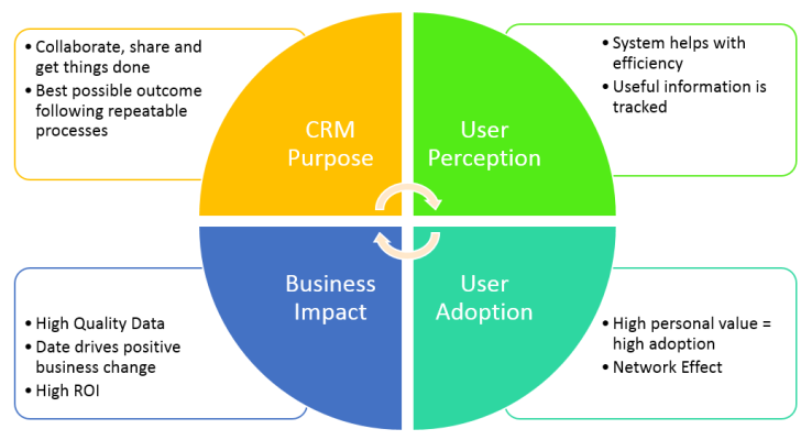
Aligning the purpose of CRM towards the end user’s needs leads to better user perception as the users consider CRM tobe giving them value by making them more efficient. If the CRM system can be seen to be delivering value to the users it leads to wider user adoption which naturally generates a greater quantity of higher quality data.
A CRM system that has a lot of quality data can be used to generate meaningful insights and actionable intelligence, and this can drive business decisions. If the business is able to see a valuable impact from the system, then they will be more likely to sustain and increase their investment in the system development as they will recognise the return on investment they are receiving.
Microsoft have summed this up in the paper as follows:
The key take away here is this: It’s very important to focus on the value CRM adds to the end users’ day-to-day activities and how it helps them achieve their goals and objectives. If this shared purpose isn’t established early and the focus isn’t enforced through design and implementation decisions, poor adoption and overall project failure will likely follow.
In order to demonstrate these principles in practice, I’ll use some sample issues I’ve encountered in my environment in the Accounts entity, though the conclusions reached can be equally applied across any system entity.
Note: the screenshots below are from a CRM 2016 (v8.1) system, and some of the issues encountered in this version of CRM can be addressed with the upgrade to Dynamics 365. Nevertheless, I hope it still provides valuable food for thought.
Sample Issues
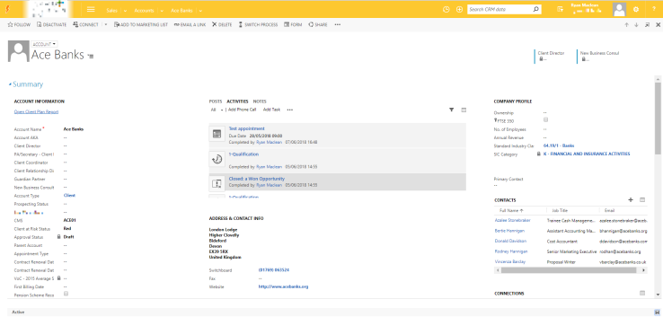
For the purposes of this section, I’ll be using the screenshot below as a reference
Long lists of fields
According to Miller’s Law, humans can only understand and process information in a maximum “chunks” of 7. In practice in CRM this means that, where possible, we should try to avoid long lists of fields as they become difficult and confusing to process, unless they can be broken into smaller sections and groups that help the users to consume the data.
On the Account form above, you can see that the Account Information section on the left is comprised of a long list of over 20 fields. The list of fields contains a number of different field types, there is not a logical flow to the fields, and they’re not grouped in a way that new and existing System Users will be able to understand easily.
Having a large list of unrelated fields also creates issues when you take into consideration the likelihood of the fields being filled in. In the example above, different fields ralte to different Account Types (i.e. clients, prospects, etc.). If there are large lists of empty fields this can be visually jarring for users, and it can reinforce negative behaviours e.g. not filling in fields when information is known.
Visual Clutter
The sample Account form is also quite cluttered visually. For example, a large amount of screen real-estate is dedicated to the Notes & Activities feed; the information in this section, whilst useful, is not accessed regularly and is usually of interest only in certain circumstances.
Similarly, though it is not visible on the screenshot, underneath the “Address” section there is a map that highlights the location of the selected address. This map is rarely used, often incorrect, and therefore consumes more space on the screen that could be utilised for more relevant information.
Utilisation of Sub-Grids vs. Associated Grids
There are a number of Subgrids on the Account form, however there is limited screen space to ensure all relevant data from the related entities can be displayed. For example, the Contacts subgrid in the screenshot above is situated on the right hand side of the screen, but there are a few potential issues with it:
- It only displays six contacts at a time. If there are a lot of contacts on the account Users would need to navigate multiple pages to find the specific contact they wanted.
- The list is organised alphabetically; whilst this makes logical sense, it is typically not the most useful form of sorting. For example, if the contacts were organised by Job Role, or by the amount of times contacted, etc. this would probably be more useful for Users
- The subgrid only displays two columns, and is therefore missing other potentially useful information that would assist users. They will have to open the Associated Grid or the individual Contacts to find the information they need
There is nothing inherently wrong with using subgrids, however if the information is used infrequently, or the amount of information that needs to be conveyed is more than can be displayed in a small grid, then it is recommended to use the Associated Grids.
Field Positions
Whilst recognising that there is a need to make space on forms for fields that are used infrequently, the position of these fields could be considered to create logical flow through the form. In an ideal scenario, the most useful fields will be closer to the top of the form, and the lesser used fields will be relocated further down. This ensures the User Experience can be optimised to minimise excessive scrolling or searching for information.
For example, the Company Profile section contains fields for Number of Employees and Annual Revenue, however they are not completed on many Accounts. The SIC code fields are also too small to display all of the information. The Primary Contact field is similarly not filled in on a lot of the records.
Multiple Forms with Similar Data
One of the great flexibilities of the CRM system is the ability to create multiple forms for entities, however lazy development can quickly lead to issues with this. When creating a new Form, Microsoft “helpfully” pre-populate the form with tabs, sections and fields for you. In order to ensure the Forms serve a purpose you should only add fields to the form if they’re required, and remove everything else. The Account entity in this example had 7 forms available to all system users. Whilst each form was intended to serve a purpose, the form design meant that there were a lot of repeated fields across all the forms, leading to confusion for Users about which Form they should be using.
Related Records Navigation
An oft-overlooked aspect of CRM Form design is the related records navigation section. It’s easy to forget to update this section, and there is a limit to the customisation capabilities for this section. In the example above the list of Related Records is not optimised to deliver best results for Users.
To reduce navigational clutter, any related records that are not likely to be used should be removed, e.g. Import Logs, Feedback, etc. The relationships should be specifically named to ensure there is no confusion (i.e. there are two “Opportunities” relationships currently visualised, but they don’t have specific descriptions. You should also group the related records into common sections to make it easier to navigate for Users.
Recommendations
In order to address the issues highlighted above, I would recommend designing your Forms to follow, where relevant, the Microsoft guidelines for user experience design.
Some of the recommendations I would implement are:
- Field Label Width – set to ensure the full label of the fields are visible and not cut off
- Tab and Section based grouping – using Form Tabs to group related fields, and sub-grouping the data into sections within the tabs
- Smart Form Design – where necessary, using business rules and JavaScript functions to hide/show fields as required, and using Field Security to restrict access to fields to specific security roles
- Removing Duplication – on occasions where additional forms are required, ensuring they are not simply a duplicate of other forms, and are designed for a specific business need.
An example of how these recommendations have been implemented can be seen below:
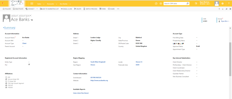
For the example above, I’ve implemented the following changes:
- Grouped fields into common sections to make it easier to find relevant information
- Used the Advanced Multiselect solution to add multiselect options
- Removed the Address composite field. I’m really not a fan of the composite fields, though I appreciate they can serve a purpose.
- Changed the “Country” field from Single Line of Text to an Optionset to ensure consistent data input
- Used JavaScript and business rules to show/hide fields based on selected account type
- Moved the Notes and Activities feed to a dedicated tab to enable it to be collapsed to save screen real estate
- Removed sub-grids where they were not serving a useful purpose
- Removed unnecessary duplicate forms
- Cleaned up the related records navigation (see below)
I think this approach has made the Form more usable, and it’s much easier to digest from a visual perspective. Taking the time to understand the User’s needs helps to ensure they appreciate the system and feel that it is working for them, rather than against them.
If you’ve got any thoughts on how to improve the User Experience please add your comments below, or get in touch with me

Published by